
Compose building blocks into anything
Page building blocks
An ordered container for your work that turns reusable pieces into a navigable layout.
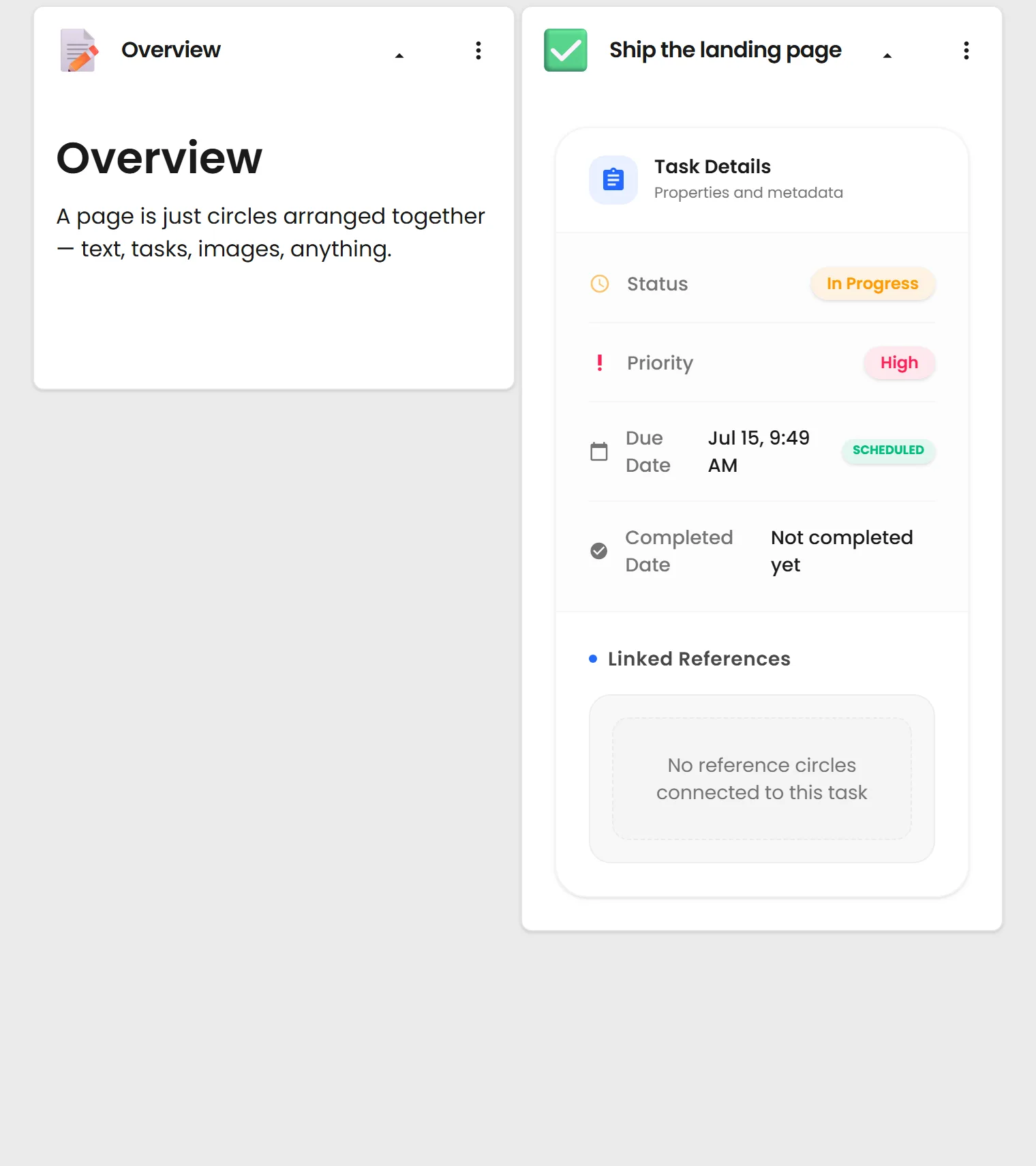
What you can do
Arrange any items into a responsive layout, in any order.
Nest pages inside pages to build whole sections.
Choose header, card, image, content, or full-item layouts at each screen size.
Select several items and change their shared layout settings together.
Compose reusable work without flattening it into one document
A Page arranges independent Circles into a responsive layout. Each item keeps its own header, permissions, history, and reuse value while the Page controls how the whole working set is presented.
What the Page editor controls
Compose any reusable items
Place notes, media, tasks, Searches, prompts, chats, and other Pages together without duplicating the source Circles.
Control the layout at each screen size
Choose header, card, image, content, or full-item presentation and tune the columns for each responsive breakpoint.
Edit several items together
Select multiple Page items and apply shared size, layout, and appearance settings in one pass.
Nest Pages into larger structures
Use a Page inside another Page to build sections, dashboards, guides, and navigable workspaces.
A quick example
Project dashboard: Show task and Search summaries as compact cards, while the current brief and AI Chat stay open in full.
Responsive guide: Use image-forward cards on a wide screen and smaller headers on a phone without creating another Page.
A simple Page workflow
Choose the working set
Add existing Circles or create the missing building block without leaving the Page editor.
Set the presentation
Pick how much of each item should appear and adjust its responsive layout where needed.
Refine the group
Reorder items, select several for a shared change, and keep each source Circle reusable elsewhere.
Change the layout, not the source
Update a source Circle once and every Page that uses it can keep working from the same reusable item.
See it live
It works with everything else you make.
Search it, place it on a Page, return to an earlier saved version, or select it as context for AI. Public items can also be shared or embedded. Learn this system once and every type works the same way.
See everything you can make